In the last part, I gave some qualitative reasoning for why I think the eventual price of Bitcoin will be about $1 million — in today’s dollars — making its market capitalization more or less on the order of USD and gold.
Let’s see if predictions using quantitative methods agree with that prediction.
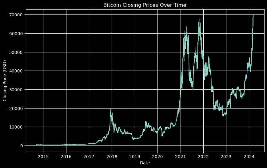
First, the history of Bitcoin prices:
This growth looks like it could be more or less exponential — at least in the short term — and it’s difficult to see the movement in the beginning with the prices plotted like this.
A common thing to do with financial data of this type, or any variable that tend to have percentage changes rather than absolute changes, is to transform the data using the logarithm.
Here we can more easily see the movement toward the beginning of the graph and rather than an exponential growth, we see something that might be linear. Let’s pull out the most common numerical data analysis tool of all: the linear regression.
This looks pretty good to the eye and gives and gives an R-squared of about 0.85 — which is very good. (In finance an R-squared of above 0.7 shows a good correlation.)
Suppose we extend this trend out for another 4 years, what do we get?
On the log scale, this can be a little hard to read. If we go back to the original prices and transform the linear regression using the exponential, we get the following.
Where we see the price just touching $1 million.
Of course, we chose the limit of 4 years to give us more or less this result, and we don’t expect Bitcoin to maintain an exponential growth in price (at least if we don’t account for dollar inflation) forever.
A more realistic long-term growth model is logistic, a sort of S-curve — again, not accounting for dollar inflation and general economic growth — where growth looks exponential for a while, then linear, then flattens off. This would be the expected model for long term Bitcoin price. However, as we have said before, it’s usually better to use the log transformed variable for financial analysis.
When we transform such a function using the logarithm, it becomes a diagonal line leading to the soft curve into a horizontal line.
This is essentially the linear regression of our current data, which we already have, followed by a slow curve into a horizontal asymptote. The problem for us is to determine what that asymptote is (the eventual price of Bitcoin) and where the curve toward it begins (the inflection point of the original logistic function).
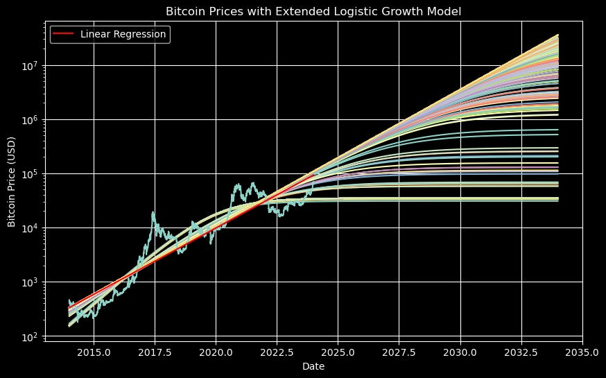
Now, while the linear regression converged essentially to a single approximation (seen in red here), this more complicated regression may easily converge to different approximations or forecasts given different initial conditions. Choosing these initial conditions can be something of an art. Here we have run 1000 regressions with initial conditions over a range of values — which may give us an idea of the range of reasonable values.
Now, on the y-axis we see the log of the price, so this is a bit difficult to read, but we can see a collection of very high prices (on the order of $10 million) and then prices that go all the way down to below what they are today.
The graph gives us some indication of the distribution of these limit prices (and the inflection points) — derived more from the actual data than from my own qualitative reasoning — but let’s see a histogram to get a better picture.
Here we see the histogram of the eventual prices from our analysis. Note, most importantly, that both the x-axis and y-axis are on log scales here. In any case, what we see is a large peak (around 45% of our forecasts) less than $100,000. Meanwhile we also have clusters around $10 million and even $50 billion.
Now, I don’t consider these forecasts conclusive by any means, but let’s also consider which of these is close to the original linear regression. Here is the graph again, with the linear regression in red.
We can see that those with limits less than about $500,000 don’t align well with the linear regression. On the other hand, the logistic model with a limiting Bitcoin price of $34,798 has an R-squared of about 0.91 — considerably above that of the linear model.
I’ll leave the reader to decide whether the qualitative analysis of the previous part or the quantitative analysis here is more appropriate.
In the next installment we’ll consider stochastic models like the one below and then move on to whether it’s a good idea to trade in the short term.
Best,
ihaphleas


